[Landing Page Teardown] How Co-working Spaces can Increase their Conversion Rate by 155%
![[Landing Page Teardown] How Co-working Spaces can Increase their Conversion Rate by 155%](https://cdn.prod.website-files.com/6756905c4f1eabb644da6afe/6a0f2052a40d7fbc1f9dad5a_6a0ec17ab6b6d7090486e70e_wp-featured_image.png)
At Tars, we are huge fans of the coworking space concept. We find that sharing a common workspace with dozens of innovative companies, run by insanely smart people helps us build a better product and provide better service.
The one place that we feel the co-working industry as a whole could improve, however, is in the discovery process.
When we were looking for the right co-working space ourselves, we found that co-working space providers often use un-engaging landing pages on their Google Ad campaigns to generate leads. We have also found, working with our clients, that such landing pages yield subpar conversion rates that could be significantly improved using a conversational landing page.
Background Information
Medium CPC
Coworking space related keywords seem to have CPCs in the 10-20 dollar range with a handful falling above or below this amount.

Price varies Location-based
Unsurprisingly, competition is mainly centred around specific cities, because most companies are not going to relocate based on the Kombucha on tap available at a coworking space in another city. In fact, the vast majority of price variation that exists on coworking space related words is based on location specific identifiers. Cities or even neighbourhoods with a more vibrant tech scene obviously have more demand for co-working spaces, and as a result more competition for related terms on Google. For example, the “coworking space San Francisco” keyword is nearly $10 more expensive than the “coworking space Los Angeles” keyword

Scheduling Tours is the main goal
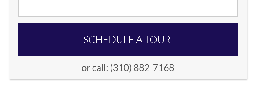
Unlike other services which can be provided through an email back and forth, the co-working space industry is deadset on scheduling tours, and with good reason. Having been for such tours while looking for our own co-working space, the Tars team knows that these spaces often have some kickass amenities that are best seen in person and can really induce conversions (actually drinking kombucha on tap is way cooler than reading it on a webpage).
The Old Landing Page
I searched “coworking spaces in LA” and a few Google Ads showed up.

I clicked on the second link and the landing page that I found on the other side looked like this:

(You can check it out over HERE)
What I like about this page…
Quite a lot actually. This page doesn’t fall into many of the same traps as previous pages we’ve looked at.
- There is no ugly form inducing prospects to drop.
- There is a long block of 3 paragraphs, but only half of it is visible in the first fold, which is pretty awesome for two reasons. First, it means that prospects have to read a more manageable amount of text when landing on the first fold. Second, because the sentence falls over into the next fold, prospects are forced to engage with the page (scroll) to read the remaining text.
- Additionally, prospects are greeted with a carousel of pictures of the space being used by what seems to be real people (i.e. it doesn’t have the fake stock image problem that the LASIK page had).
What I don’t like about this page…
At a general level the design feels a little boring. The colours are a bit plain and there are certain elements on the page which look incomplete. For example, team fold has only one person’s image in it left-aligned, which makes me feel like there should be more people to the right where there aren’t any currently.

My biggest qualm, however, is how this page looks on a mobile screen, and to be quite honest, it’s not really the creator’s fault. Traditional landing page design is made for desktops and laptops first and then optimized after the fact for smaller screen sizes. The end result is that the mobile webpage feels more wordy and cramped than the desktop version.

More specifically, the text visible in the first fold fills up a greater proportion of the page and the image carousel which I really liked, becomes smaller, taking up a smaller proportion of the page, making the exact same webpage feel way more text-heavy.
The New Landing Page
Using the information on the old landing page I created a conversational landing page that serves the same purpose (provides info and captures leads):

(You can check it out over HERE)
A conversational landing page like this addresses the mobile webpage problem purely because it is structured as a chat. Over the last few years, as we have explored the ways in which conversational landing pages help increase conversion
Unlike traditional landing pages, the chat interface was made primarily with the mobile user in mind and then was ported over to larger screens. There is less text on the page, the input UIs are at the bottom of the screen close to the prospect’s thumb and the proportions of each element are naturally bounded by the dimensions of a smaller screen. All of these provide a user experience that is hyper-optimized for the way people interact with their phone screens and ensures a higher conversion rate.
Conversational Landing Page Best Practice: Non-text elements
Even in a chat experience where new message bubbles appearing on screen provide a constant stream of visual stimulation, an over-reliance on text can become cumbersome for the prospect. Put simply, even if a minimalist chat interface is text-only, the landing page experience becomes dull. To avoid this mistake we recommend that conversational landing pages creators include rich, non-text elements throughout their conversational flow.
Not only to they break the monotony of text, but they can also serve as a mental shortcut for prospects to more quickly understand what is being asked of them on-screen. For example in the conversational landing page above I incorporated non-text elements in three ways. First as images at a few points of the conversation to give prospects an engaging break from reading text:

Second as icons within the quick reply buttons to provide them with a mental shortcut to quickly understand each button:

And finally as emoji within the flow to again break the monotony of text and provide a mental shortcut for quicker reading:

Conclusion
As the internet becomes an increasingly mobile-dominated space, it is important for marketers to think about how their lead generation experiences are viewed on small screens.
With an increasing amount of product discovery occuring on smartphones, having a truly mobile optimized user experience is important. Of course the limitations of traditional webpage design inhibit the ability to achieve this. Invariably, technically optimized pages are riddled with design issues (like cramped elements), making for a bad mobile UX. Conversational Landing Pages could serve as the ideal solution to this problem. Chat interfaces are the only truly mobile-first user interface on the web, thus ensuring a frictionless lead generation process that yields a high conversion rate.

Arnav is the Director of Content Marketing at Tars. He spends most days building bots, writing about conversational design and scrolling through Giphy’s trending section looking for the gifs that go into the Tars Newsletter.

Recommended Reading: Check Out Our Favorite Blog Posts!

Easy Marketing Optimization with Chatbots – Beginner’s Guide

Using a Chatbot for Commercial Real Estate – Beginner’s Guide

AI for Internal Communications and Employee Management

Our journey in a few numbers
With Tars you can build Conversational AI Agents that truly understand your needs and create intelligent conversations.


years in the conversational AI space

global brands have worked with us

customer conversations automated

countries with deployed AI Agents