Conversations will save your PPC Conversion Rate
Your Landing Page is killing your PPC Conversion Rate. Conversational Landing Pages could be the CRO tool which fixes that.
Picture this.
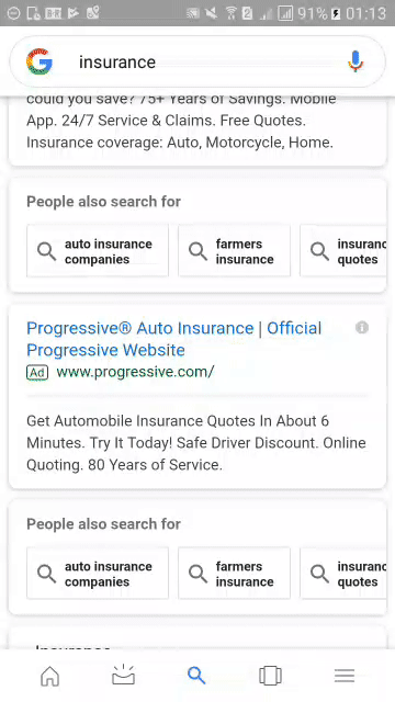
You are looking for a car insurance policy. You Google “car insurance” and a whole bunch of Google Ads show up. The first link is from a huge company whose ads you’ve seen on TV, so it must be trustworthy. You click on it and the landing page is exactly what you’d expect. There is a picture of a smiling insurance agent staring lifelessly into your soul. She promises that if you provide your zip code below, you’ll get quick and easy quote. It isn’t particularly engaging but it’s car insurance. How exciting could it really be? A few key taps later, you’ve entered your zip code and hit submit.
Everything from here on out is a slow moving train wreck.
Hitting submit causes your screen to go blank. The page is loading. While waiting for it to finish, you look up at the ceiling of your bedroom and notice a weird spot. That’s odd! You were staring at your ceiling the night before while candy crush was loading, and the spot wasn’t there. Or was it? Your mind is probably playing tricks on you. You look back at your screen.
The UI elements have started to appear. There is clearly a form you are going to have to fill, asking for your name, address, etc. But, as is often the case with mobile websites, the page jerks around as new elements are rendered. You go back to staring at the spot on your ceiling. Is it bigger since the last time you saw it? Is it mold?! Holy shit! It’s probably mold! You have to find out. You open a new tab, and look up what a mold spot looks like. Google has you covered with an article (from ABC news of all places), which you start reading. Apparently mold can make you really sick! You had a headache yesterday! Was it mold related? New tab, new google search: “Mold sickness.” Things are not looking promising. It turns out mold sickness can kill you.
It’s now been 20 minutes and you have completely forgotten about your car insurance search. Instead you are on the Wikipedia page of famed civil rights activist and academic W.E.B du Bois. From the perspective of the company whose Ad you clicked, you are 50 bucks down the drain.
This sort of interaction is not uncommon in the PPC industry. It is reflective of a bigger problem in the industry.
The way we think about PPC landing pages is broken.
Good quality images, videos, testimonials and CTAs are all considerations you are told to keep in mind while creating a landing page. But no matter how many of these best practices you incorporate in your landing page, the end result is un-engaging and yields abysmally low conversion rates. It is no accident that the average landing page conversion rate across industries for Google Search Ads is 2.35%.
Why do PPC landing pages suck?
A co-worker of mine likes to compare the way the PPC industry thinks of landing pages to Plato’s Allegory of the Cave. Within the industry there is a definite picture for what landing pages should look like and how they ought to function. But like the individuals in Plato’s Allegory, the PPC industry is imprisoned in a cave looking at a mere shadow of what their post-click experience could look like.
According to one of the industry’s leading landing page tools this is a good landing page template:
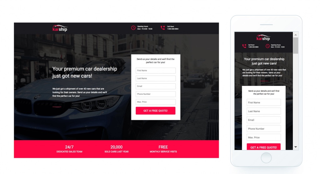
On the surface it looks great! Clean(-ish) design, bright colors, a clear value proposition, a lead-capture form and even a number listed for those who want it.
Prospects who land on such a page have to read through the site for more information and fill out a form to express interest in the product or service. These tasks are easy enough to complete and are the standard for all post-click interactions. Most, if not all landing pages, follow this same formula of visuals, text and forms to capture leads.
But have you ever stopped to consider whether this is truly the best way to design a landing page?
To me, there are three glaring deficiencies in traditional landing pages:
- they are not optimized for phone screens,
- they are un-intuitive
- they are un-engaging
These deficiencies are preventing you from achieving true PPC conversion optimization.
Static Landing Pages are Mobile Un-optimized
To be clear, when I speak of mobile optimization (or the lack thereof) in traditional landing pages, I am not focusing on the technical aspects of optimization. Rather, I adopt a more design-focused critique. Traditional landing pages are made for desktops and laptops first and then re-configured for phones. In the process of adjusting the elements on the page the UX suffers. In the example above, the mobile version looks more cluttered. You can barely see the background image; The elements on the page are squished together; And worst of all, a form covers the vast majority of the page.
Nobody likes forms. They are a mundane part of the web which we reluctantly tolerate.
Greeting prospects with a form is a sure shot way of telling prospects to drop off from your page. Of course, the small screen size means that designers have little recourse to solve the issue. Making the form smaller would render it unreadable and unusable, and having the form lower down in the page will confuse prospects as they won’t know how they can take action on the page. In either case, the result is prospects unnecessarily dropping before converting.
Static Landing Pages are Unintuitive
While the general template of PPC landing pages does remain the same, changes in color, CTA, images and even the placement of page elements, are disorienting. Think about it. Most landing pages look different from one another. Every time you land on one, it takes a few seconds to figure out where everything is. For prospects who are not as tech-savvy nor patient as you might like, this is a problem. If you target older demographics (e.g. your parents or grandparents), having an interface that is even slightly too complex might cause prospects to drop without converting. Even for a millennial like myself, I don’t give most landing pages the time their owners expect.
Static Landing Pages are Not Engaging
Perhaps the most egregious shortfall of traditional landing pages is that they are boring. Once a prospect has gone through the process of orienting themselves on your landing page, they need to interact with the site to get what they want. The methods traditional websites use to get these tasks done are mundane. In the age of Instagram and Facebook, even filling out a short form, is mind numbingly boring. Further still, these tasks are impersonal. Even though businesses spend time and effort building and analyzing their landing pages, from the prospect’s perspective, no one from the business is actually present when they fill out the form.
Put simply, traditional landing pages are un-engaging.
This might seem like a trivial issue, since the purpose of an Ad campaign is not to have fun. But the effects of an un-engaging post-click experience are catastrophic for businesses dependent on paid traffic. With ever-shortening attention spans, unengaged prospects will drop without converting. Low conversion rates mean wasted ad-spend, less business and a never-ending spiral of increasing costs, and lower revenue.
Conversational Landing Pages are the solution
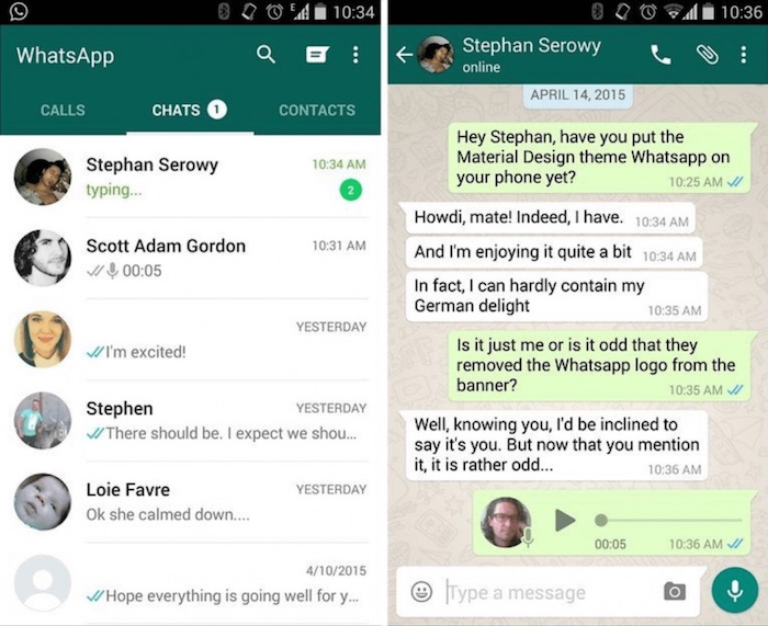
This is what a conversational landing page looks like:
Its universally understood, universally beloved chat interface addresses all the three shortfalls of traditional PPC landing pages.
Conversational Landing Pages are Intuitive
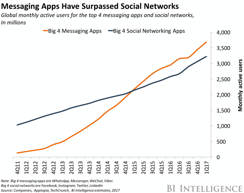
Chat apps in the modern age have become ubiquitous. More people today use chat apps than social media apps and I am willing to bet that even you spend a considerable amount of time during the day in a chat app (e.g WhatsApp, FB Messenger, Viber):
This means that when you show a conversational landing page your prospects (regardless of who they are), they will understand exactly what the website expects of them.
Conversational Landing Pages are Mobile Optimized
Unlike websites, chat interfaces were made primarily with the smartphone screen in mind. The existence of WhatsApp is a proof of this. Years ago (2010 or 2011), I bought my first internet connected phone. It was one of those Nokia phones that ran SymbianOS. While the phone’s measly specs and hardware keypad pale in comparison to the smartphones of today, I would still consider it to be the first smartphone I have ever owned. What differentiated it from the previous feature phones that I had owned was not that it’s web browser was more advanced, but the fact that it ran WhatsApp.
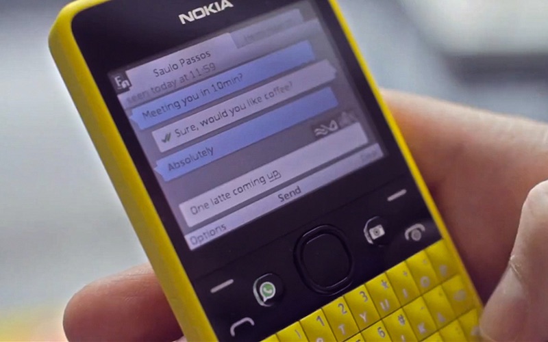
The chat interface of WhatsApp defined early on what would be considered a smartphone and what would not. Eight years on, chat apps like WhatsApp continue to be popular with little change to their interface. The paradigm of to and from message bubbles persists.
This sustained popularity is the proof that the interface is the most natural way to interact with a small screen.
Conversational Landing Pages are Engaging
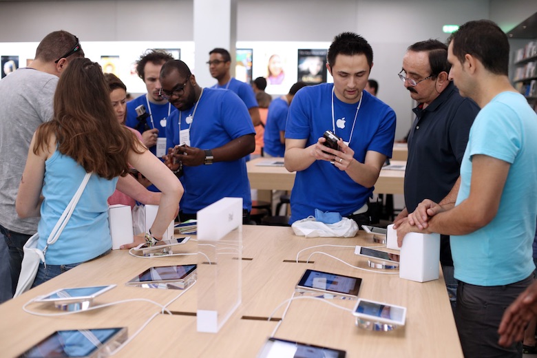
The difference between having a Traditional Landing Page and Conversational Landing Page, is the same as the difference between a grocery store and an Apple store.
When you walk into a grocery store, you have to pick out all the products you want to buy on your own, enlisting the help of signs and memory to navigate your way around. The process is doable, but mundane. In an Apple store on the other hand, a smiling store attendant greets you, figures out exactly what you need, answers your questions and even gives you advice based on what they might do in your situation.
The interaction at grocery store, is not necessarily a negative one but it certainly isn’t memorable. The Apple store interaction, on the other hand is positive experience that the customer will remember for days.
Conversational landing pages are the Apple store of the web.
The back-and-forth nature of the interaction, makes users feel like they are getting a personalized experience whose direction they can control. Since they are presented with a few message bubbles at a time instead of a whole page of text, prospects spend less effort figuring out how to advance their interaction. Traditional landing pages on the other hand are like grocery stores. Filling out forms and clicking on buttons are mundane tasks that will fade from memory.
The Upshot
Using conversations to drive business is not a new idea. Throughout history, and even in the present, conversations have facilitated trade between individuals. When a clothing store attendant helps you find the right pair of jeans or when someone offers you a free sample at a grocery store, you are conducting business through conversation.
In the past decade, the internet has disrupted this way of conducting business.
In return for the convenience of buying things from their office cubicle, couch or bed, customers endure landing pages where they have to put in their own time and effort to make purchases. This has made businesses complacent. We assume that such behavior means that the public doesn’t care for engagement, or human connection. Such an idea is misguided to say the least. While human behavior patterns might have changed in the past decade, our basic instincts and desires have not. Every prospect that clicks on your PPC Ad wants a good customer service experience post-click. Till recently, you could throw up your hands. Pictures, videos and shorter forms were the pinnacle of good landing page UX.
Conversational landing pages raise the bar. They allow you to give users the personalized service that they want and deserve without making them concede any convenience.

Arnav is the Director of Content Marketing at Tars. He spends most days building bots, writing about conversational design and scrolling through Giphy’s trending section looking for the gifs that go into the Tars Newsletter.
- Why do PPC landing pages suck?
- Static Landing Pages are Mobile Un-optimized
- Static Landing Pages are Unintuitive
- Static Landing Pages are Not Engaging
- Conversational Landing Pages are the solution
- Conversational Landing Pages are Intuitive
- Conversational Landing Pages are Mobile Optimized
- Conversational Landing Pages are Engaging
- Conversational landing pages are the Apple store of the web.
- The Upshot


Build innovative AI Agents that deliver results
Get started for freeRecommended Reading: Check Out Our Favorite Blog Posts!
How We Created A Newsletter That Helps Us Close $50k Deals From Cold Leads
[Webinar] How Chatbots And Push Notifications Can Supercharge Your Website Conversions
Reduce PPC Spend in 2019 While Still Driving Exceptional Results
Our journey in a few numbers
With Tars you can build Conversational AI Agents that truly understand your needs and create intelligent conversations.


years in the conversational AI space

global brands have worked with us

customer conversations automated

countries with deployed AI Agents