[Designing Conversations] How to make a Conversational Landing Page for a Home Healthcare Marketing Campaign
In an increasingly crowded healthcare market, it is difficult to stand out from the crowd. Most healthcare providers rely on dull, uninspired landing pages to generate leads from traffic that has an especially low attention span. Within this context, conversational landing pages are an effective tool for marketers to create engaging lead generation experiences that convert. In this guide, we show you the ins and outs of making conversational landing pages for healthcare marketing by walking you through an example.
Try out the Right at Home Conversational Landing Page: http://bit.ly/2J0hn2y
Examine the Traditional Landing Page: http://bit.ly/2ZRS2x2
And be sure to check out our written guide below 👇
Landing Page Assessment
I looked up “healthcare at home” and as expected I was greeted by four ads as the first four search results. Clicking on the third link dropped me into this landing page:
As far as Google Ads Landing Pages go, this one is as standard as you can get. It literally hits all of the marks of a traditional landing page. The user experience involves prospects reading a wall of text and filling out a lead capture form to generate a lead. If you showed most people such a page they’d know exactly how to use it, but would they enjoy using it? Likely not. In fact, I’d even bet that most of them will straight up drop without converting.
Creating the Conversational Landing Page
We created our healthcare conversational landing page from scratch, using our tried and tested three-stage approach. For the uninitiated, conversational landing page design can generally be split into three distinct stages corresponding to three different aspects of the page itself: the hook, the lead gen flow, and the design. Here’s a break down of each one.
The Hook
Most visitors drop from a page within the first 7 seconds. This means that if you want to optimize your flow for conversions, the most efficient way to tdo so, is to focus your effortson the start of the conversation. This is where the hook comes into play. The hook is a series of three messages and a user input that establishes the legitimacy of the page (welcome message), captures user attention (value proposition message) and shepherds prospects into the lead generation process (ask message + user input).
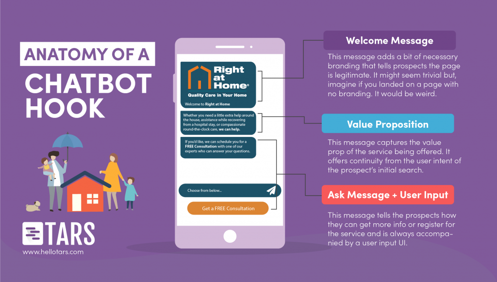
So how can you optimize these messages? Here are a few key optimizations that you should never forget:
- Use a logo in your welcome message- Landing pages without logos look generic, and generic landing pages look spammy.
- Keep it concise- Don’t make any message an essay and don’t send too many messages at once. We recommend three tweet-length messages.
- Make your ask uncontroversial- Don’t ask for personal information until the conversation has started. A good test for this: If the user response can be a single button you’re golden.
Lead Generation Experience
Once you’ve begun the conversation, lead capture becomes easier, but you aren’t out of the woods yet. Asking for information through a chat is very different from asking for the same information through a form. Forms are impersonal by nature, meaning that it is socially acceptable for you to say “First Name” and then a blank field or “zip code” and then a blank field. In a chat, on the other hand, you are bound by human etiquette. You must be polite and you must provide good customer service. There are three simple best practices that you can implement to achieve this:
Ask full questions
Saying “Name?” or “Name:” in a message is abrupt. It comes across as casual at best and rude at worst. Instead, go that extra mile and phrase the message as a full question like “What is your name?”
Acknowledge user input
If a prospect sends you a piece of information, acknowledge it (even if you just say “great”) and, if required, inform them of what’s to come (something like “I need a few details to get you set up”). If you don’t include spacers like this, your conversation will feel more like an interrogation than a customer service experience.
Order your questions right
This comes back to the emphasis on politeness in conversational design. Certain ways of ordering questions can feel rude, and you want to avoid them at all costs. The two most obvious ways of doing so are to ask for the name first, because, in real human conversations, you always like to know who you are speaking to.
And to reserve contact detail questions to the end for the end, because an early ask for these details can be perceived as “sales-y.”
Design
Conversational landing pages use text to convert prospects but this doesn’t mean you should neglect the visual aesthetic of your page. The default chat design on TARS is the generic blue and gray color palette of Messenger and iMessage. Unless your company has the same brand colors, your page will look super generic if you don’t change it. As I mentioned earlier, generic pages look spammy and spammy pages don’t convert. We recommend making the bot messages your primary brand color and the user messages your secondary brand color, or if you have just one color, make both types of messages that color.
End Result
By the end of this creation process, you should have a conversational landing page that engages prospects in a way that traditional landing pages just can’t.
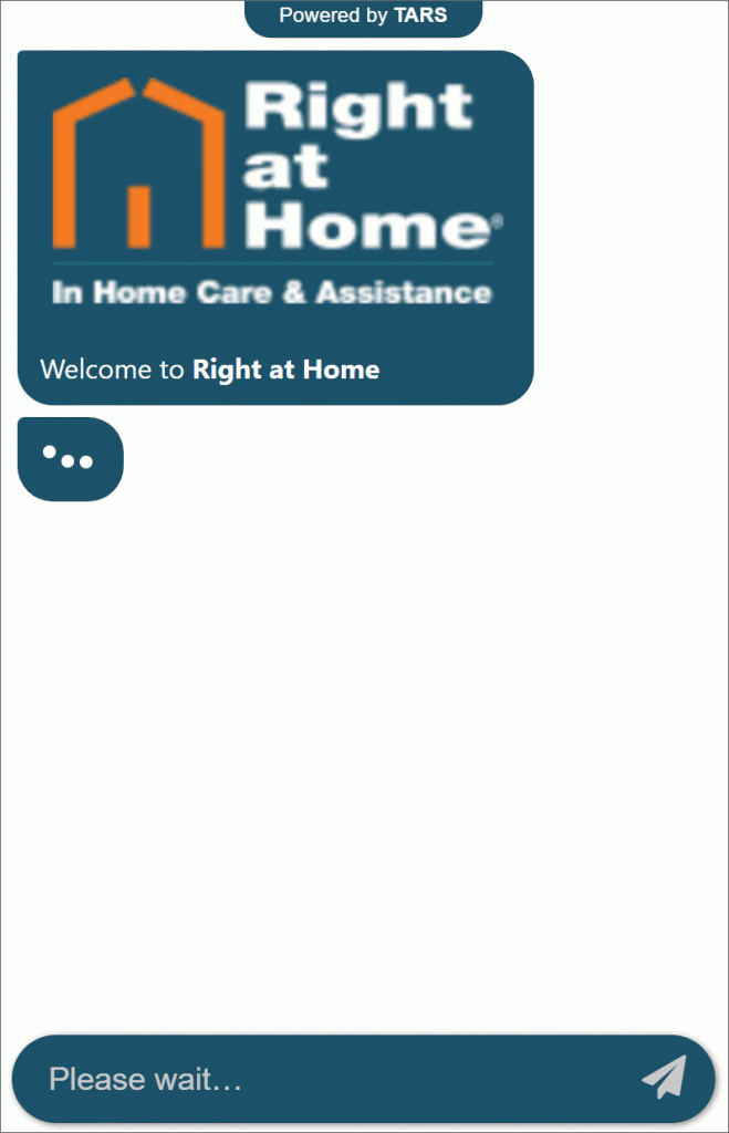
Of course, creation is just the first step. Once you’ve built your page, share it with your colleagues, family members, and friends to get feedback and source grammar errors. Even after you’ve deployed your bot, use our analytics tools to monitor your bot’s performance and tweak the flow for greater conversions. If you’re still having problems, send it to us on Intercom and we’ll be more than happy to diagnose your bot for free. At the end of it all, you will have the high-converting lead generation experience that drives more business for less ad spend.
Arnav is the Director of Content Marketing at Tars. He spends most days building bots, writing about conversational design and scrolling through Giphy’s trending section looking for the gifs that go into the Tars Newsletter.
Recommended Reading: Check Out Our Favorite Blog Posts!
[Designing Conversations] How to Make a Chatbot for a Home Insurance Provider
[Designing Conversations] How to Make a Chatbot for a Real Estate Marketing Campaign
[Designing Conversations] How to Make a Conversational Landing Page for a Credit Card Marketing Campaign

Our journey in a few numbers
With Tars you can build Conversational AI Agents that truly understand your needs and create intelligent conversations.
years in the conversational AI space
global brands have worked with us
customer conversations automated
countries with deployed AI Agents


