How To Infuse Visual Branding Into Your Chatbot
In these best practices posts, we generally discuss the sorts of decisions that are unique to the art of bot creation.
Well, this post is different.
In this best practice, we will discuss the importance of making your bot look the part visually so that you have brand coherence in your marketing campaigns.
Why The Visual Design Of Your Chatbot Matters?
Even though chatbot development depends primarily on text, images and video to communicate with users, they are at the end of the day user interfaces comprised of visual elements on the page (the message bubbles, user input etc.)
These basic elements that constitute the chatbot need look the part in your marketing campaign for one simple reason:
Coherence.
Just like with any other piece of content that you put out, your chatbot is a representation of your company. A big part of being an accurate representation is fitting in with the visual aesthetic of the rest of your branding.
If all of your webpages, brochures, blogposts and videos use red and yellow heavily (because those are your brand colors) but your chatbot has a green and blue theme, the bot is not going to look like it is a part of your company.
This lack of coherence will undercut your legitimacy, make brand recall difficult and generally hamper your ability to generate leads.
How to make your chatbot look the part?
To begin with, let’s establish what the visual elements of a chatbot are.
We generally break a chatbot down into four parts
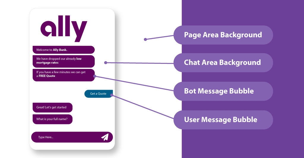
As a bot maker, you need to decide how each one of these looks so that it fits with the rest of your branding.
There is no right way of transferring the aesthetic over, and you should absolutely experiment, but I have found an easily repeatable approach that works for me.
1) Decide on the Chat Area Background
I usually decide what I am going to put in the chat area background before choosing anything else because it is literally in contact with every other element on the page. The message bubbles are on top of the chat area, and the chat area is on top of the page background.
When choosing a chat area background I go with one of three approaches.
If the first fold of a company’s landing page has a neutral white background, I use white as the chat area background as well, because I feel like it does a good job of feeling like an extension of the rest of the company’s web design.
Alternatively, if I haven’t used the logo elsewhere in the chat (e.g. in the hook), I will add the company’s logo (usually a slightly transparent version) in the background. This example from Montana’s DMV chatbot isn’t one that I created but it is a great example of how this approach can be implemented to make the chatbot feel like it truly belongs on the company’s webpage.
Finally, if the landing page makes heavy use of a brand color in the background of their first fold, I use that color as the background of the chat area, again, because it feels like an extension of the rest of the page. A good example of this is the TARS chatbot. It has a purple background because the first fold of our page has a purple background as well.
2) Page Background
For the page background, I have two approaches. If the chat area background is primarily white, I will make the page area white as well. This makes it feel like the page area is an extension of the chat area and makes the entire page feel more seamless.
If it is colored or has a logo in it, I also sometimes, depending on the context will add an appropriate image to the background. Montana’s DMV chatbot, again, is a great example of this:
3) Decide on the Bot Message Bubble Colors
I go with one of two approaches for deciding this.
If I used the logo in the background or white background, I make the bot message bubble colors match the primary color of the brand. More often than not (i.e. when the brand has good design thinking behind it), the primary brand color usually stands out pretty well against the plain white background.
If I used the company’s primary brand color in the chat area background, I will make the bot message bubble color the secondary brand color from the company’s landing page. To find this, I go to their landing page and look at the second most prevalent color on the page and use that.
4) Decide On The User Message Bubble Color
The user message bubbles present responses that the user has given through an input UI, so they are basically the results of someone engaging with a CTA. As such for the user message bubble colors, I just go with the color of the CTA from the traditional landing page.
Conclusion
Chatbots are a unique way to boost user engagement in the lead generation process. Of course, to see any of that benefit, you need to ensure that it meets all the basic requirements for being a digital asset of your company. Of these requirements, branding is the most basic yet important one. Having a generic-looking chatbot undercuts the legitimacy of your company and causes people to drop. This is why we highly recommend that you spend the minimum amount of time it takes to make your chatbot look the part.
Arnav is the Director of Content Marketing at Tars. He spends most days building bots, writing about conversational design and scrolling through Giphy’s trending section looking for the gifs that go into the Tars Newsletter.
- Why The Visual Design Of Your Chatbot Matters?
- How to make your chatbot look the part?
- 1) Decide on the Chat Area Background
- 2) Page Background
- 3) Decide on the Bot Message Bubble Colors
- 4) Decide On The User Message Bubble Color
- Conclusion


Build innovative AI Agents that deliver results
Get started for freeRecommended Reading: Check Out Our Favorite Blog Posts!

How to Use a Chatbot to Query Database via APIs

How to create and use a medical chatbot for medical diagnosis, symptom checking and more: detailed guide
Automation of citizen service executive role and responsibilities with chatbots

Our journey in a few numbers
With Tars you can build Conversational AI Agents that truly understand your needs and create intelligent conversations.
years in the conversational AI space
global brands have worked with us
customer conversations automated
countries with deployed AI Agents


