[Product Update] Track Chatbot Performance Over Time Using Timeline Graph
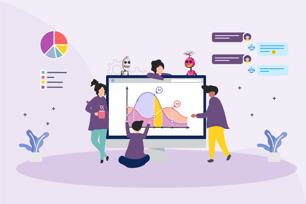
The timeline graph feature is the latest addition to the data analytics section of the TARS. We envision this as a versatile tool that allows bot creators to track how their chatbot is performing over time and use its insights to supercharge the bot testing and optimization process. Check out our updated Data Analytics video to see how it works:
The five metrics that are visualized are the same five metrics that have been available in TARS since we released the data analytics section:
- Unique Bot Visits : Total number of unique users who visited the Bot page
- Bot Conversations : Total number of unique users who interacted with the bot and started the conversation (Full + Partial). If a user has interacted with the bot twice, it will be counted as one.
- Bot Goal Completions : Number of Bot Conversations where the Bot Goal is achieved. Set the Goal Gambits in Configure >> Goal Settings to see the stats here.
- Bot Interaction Rate : (Bot Conversations/Unique Bot Visits) * 100
- Goal Conversion Rate : (Bot Goal Completions/Unique Bot Visits) * 100
Why does it matter?
The most important stage of bot creation is not the initial conceptualization, planning or building. It is the optimization and testing that happens after you’ve deployed your chatbot and let it run for a few months. Almost a year ago, we increased our conversion rate by 60% through repeated testing.
Previously, the Tars data analytics section would show you only the numerical values of the five key metrics required to make a good conversational experience:
This approach was valuable for getting an overview of how your bot was performing in fixed but it was difficult to assess how that performance was changing across time. For example, we have experimented with the messaging copy of the Tars main bot several times over the last 2 years and the only way for us to assess whether these changes actually made a difference was by exporting the conversation data to excel, cleaning it, and then creating graphs of it to draw out trends.
The New Data Analytics visualization feature fixes this problem. It visualizes conversation data for you so that you don’t have to go through the hassle of exporting all of your data, and visualizing it in MS Excel to understand exactly how changes in your conversational flow are affecting your conversion rate so that you can rapidly adapt your conversational flow to the changing needs of your digital marketing prospects.

How can you use this new feature?
You can either watch the video we embedded at the top of this post or if you prefer reading, check out our updated data analytics help doc.
Arnav is the Director of Content Marketing at Tars. He spends most days building bots, writing about conversational design and scrolling through Giphy’s trending section looking for the gifs that go into the Tars Newsletter.
Recommended Reading: Check Out Our Favorite Blog Posts!
Resolve Complex Customer Queries With Tars Live Chat
Improve Your KPIs Using Tars WhatsApp Campaign Scheduling Feature

Hyper-Optimize Your Chatbots With User Flow Analytics

Our journey in a few numbers
With Tars you can build Conversational AI Agents that truly understand your needs and create intelligent conversations.
years in the conversational AI space
global brands have worked with us
customer conversations automated
countries with deployed AI Agents

