We created a new Logo. Here’s how we did it!
Ok so, we had been thinking of updating our dingy, old logo for a long time, but just couldn’t get around to it because… well… it turns out running a startup is time-consuming😅
That changed a few weeks back when we had the jarring realization that our now old logo was downright bad🤢
The wake-up call came while we were preparing one of our bigger product updates👷♂️
We were gearing up for a big launch for the Tars integration on Zapier, the popular task automation app, and while testing the beta, we caught an unfortunate glimpse of our logo in the Zapier app directory😲
How do I put this delicately?🤔
It felt like someone had kicked me in the balls.😣
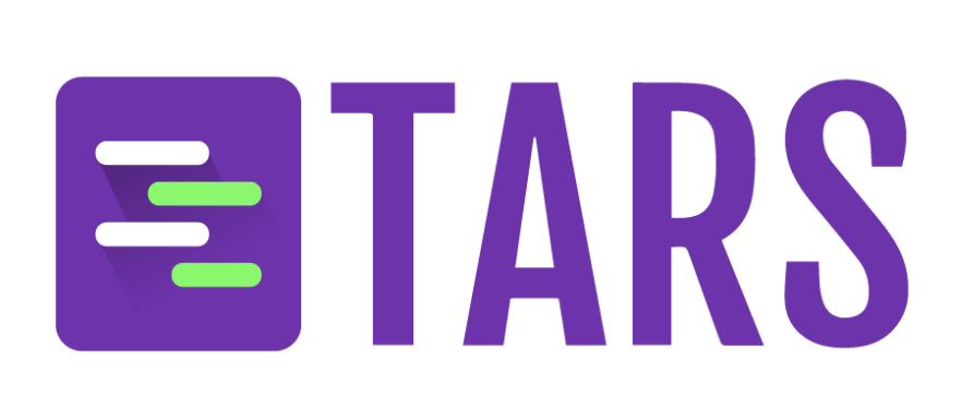
Our old logo was just the text Tars in Fjalla One typeface on a purple square. Super difficult to read, especially when the icon was small, and compared with the hundreds of other icons in the Zapier store, it looked downright shoddy.😥
It most certainly was NOT befitting of the Most Fun Chatbot Company in the World™👎
We decided almost immediately that we wanted someone to work on designing a new logo full-time for a few weeks📆
Our marketing design work is outsourced to a company called Delesign, and they connected us with a kick-ass designer named Keano⭐
Keano is a wizard🧙♂️
You give him a design brief, and no matter how vague you are, he transforms it into a work of art🎨
He was the right man for the job, so we went to him for our logo design.
This is where things started to get tricky😤
We knew that we wanted the company logo to reflect our product as simply as possible, but that is easier said than done.
How do you describe something that doesn’t exist yet? 😵
I want to say that we came up with an ingenious way to get around this, but honestly, we used some good old trial and error.😋
As a team, we brainstormed a bunch of SaaS logos that we liked (Trello, Intercom, LinkedIn, Bitbucket, Baremetrics, Heap, Stripe, and, of course, Zapier) and wrote down why we liked them.✍ Some of the common characteristics that came up were simplicity, uniqueness, recognizability, precision, beauty, and perhaps the most intangible of them all, “the logo just matches the product really well.”
Next, we came up with a bunch of characteristics that we associated with our brand, and came up with things like colorful, playful, quirky, funny, and meme-inspired.
We sent Keano all of these lists (the logos we liked, their characteristics, and our brand characteristics), and gave him an idea of where our logo was going to be used, e.g., on the Zapier App listings page.
And so the trial and error began.
A few hours later, Keano gave us the designs!
We immediately knew what we didn’t like about it🤨
All the logos in this first pass relied on speech bubbles💬 and robot faces🤖, and after seeing them on paper, we knew that we didn’t want either in our logo
Robots and speech bubbles seem like a natural fit for a chatbot company, but they had issues.😐
We felt that using speech bubbles for a chat/chatbot brand was overdone and that features of the robot face were too complex for a logo.
We told Keano to skip the robot face and message bubble, and here is what he came up with these designs👇
The results were encouraging.
In particular, the whole team liked the concept of the 2nd and 8th designs because they looked like a super simplified version of a conversation with a chatbot, and maybe we are biased, but we feel like chatbots hit a lot of those characteristics we were talking about earlier. They are simple, recognizable, fun, playful, and they certainly match our brand.🤷♂️
So, using these two designs as a starting point, we gave Keano a few pointers about how he could improve the design (e.g., round out the message bubble corners and add some color), and here’s what he came up with.
This was now getting interesting🤩
I personally liked the 2nd and 3rd design, and I wanted to see how it would look like once deployed, so we asked Keano to make some mockups showing how the logo would look in different contexts (e.g,. on our website, in an app listing page, on a t-shirt, etc).
We circulated this again among the team, yet again, for more feedback, and a few good points were brought up💡
The logo was vertically accentuated (i.e., it was kinda long) and that made it look odd on an app listing page🙃
To help resolve this, we took some inspiration from the ratios in the Google Forms Logo (Ironic, considering that our company’s stated aim is to rid the world of forms).
As a consequence of the reduced height, we concluded that it would be better if there were only four “message bubbles” instead of six within the outer box.📉
We also wanted to try some variations on border-radius and brighter and more dynamic shades of violet color and Keano was more than happy to oblige all our changes
We were getting closer, but weren’t quite there yet.
The logo needed some polish, so after adjusting the spacing between elements, adding a sick drop shadow to the message bubbles, and changing the shade of violet from “#704589” to “#6d33aa” so that it was brighter, we came up with our final logo!
After that, we pretty much had to do some basic due diligence (e.g., checking it out in favicon format, getting some basic color variations like a plain black version and a plain white version), and we were all set to roll it out📢
The whole process of making the logo took us around 19 days, and we are pretty happy with the result!
We condensed a lot of these learnings to build an AI Agent that helps others create logos with the same precision while cutting down on time. Build your logo in seconds with our AI Logo Generator!
Recommended Reading: Check Out Our Favorite Blog Posts!
Resolve Complex Customer Queries With Tars Live Chat
Improve Your KPIs Using Tars WhatsApp Campaign Scheduling Feature
Hyper-Optimize Your Chatbots With User Flow Analytics

Our journey in a few numbers
With Tars you can build Conversational AI Agents that truly understand your needs and create intelligent conversations.
years in the conversational AI space
global brands have worked with us
customer conversations automated
countries with deployed AI Agents


