In high friction, form-heavy world of insurance marketing, conversational landing pages offer marketers an affordable way to increase conversion rates and provide a more engaging user experience to their customers. Before they can see any of these benefits, however, they have to actually build a conversational landing page and that can be hard. Designing a conversation landing page is nothing like designing a traditional landing page. Instead of focusing on layout, folds, and forms you need to focus on hooks, branching, and etiquette. We created this guide to help you navigate this new paradigm of lead generation. At TARS, we believe that the best way to teach someone is to just show them how it’s done, so last week I dedicated a whole day to exploring insurance landing pages and recorded the whole process of transforming it from a low-converting traditional landing page into a high converting conversational landing page. Check it out.
Check out the Amica Conversational landing page over here:http://bit.ly/2DDDaJp
And the Amica Traditional Landing Page over here: http://bit.ly/2GqIrEr
Landing Page Assessment
The landing page I examined for this guide was Amica’s Auto Insurance landing page. I landed on it through a Google Ad on a branded keyword for Amica auto insurance which I found while doign keyword research on the space.
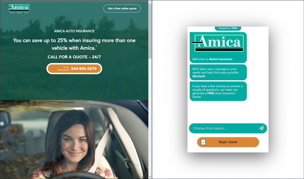
Honestly, it ’s not that bad as far as traditional landing pages go. There isn’t much text on the page which is great (people hate reading) and I am a big fan of the video behind the first fold that they have in the first fold. On the lead generation front, they have two options: call-based and form-based lead gen; And judging by its prominent placement in the first fold, I am going to hazard a guess that Amica call-based approach. This makes sense because conversational lead capture consistently out-performs form based lead capture.
Using a Chatbot Template
When you are building super complex bots like auto insurance quote bots you should seriously consider using achatbot template as a starting point. Auto Insurance lead generation and qualification flows can be super complex and creating one from scratch will take days if not hours to complete. Using a Template as a starting point reduced this time to a matter of minutes because someone else has done most of the work for you. That being said, when using a template you must be careful to make a few changes before hitting deploy on your conversational landing page.
Change the Branding in the Page
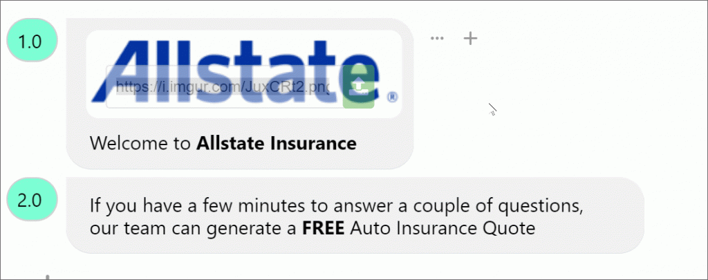
This might seem a little cumbersome, but be sure to check every single gambit in the flow to ensure that the names, branding etc. match your company not some other company. It would be super embarrassing if you worked for Amica and published an Allstate conversational landing page to your Google Ads campaign.

Be particularly careful of this in the hook (i.e. the first three messages of the conversation) where most templates contain a company logo and value proposition message.
Check that all the details that you need are in the flow

While most auto insurance lead generation flows are similar to one another, they are not exactly the same. If you are using a chatbot template, be sure to run through it once or twice on your own to see what details it collects and what details it doesn’t, noting down what you need to add remove and change.
Conversational Landing Page Best Practices
While tweaking your conversational landing page template, there are a handful of best practices to keep in mind. Here are the most important ones that you absolutely should not forget to incorporate:
The Hook
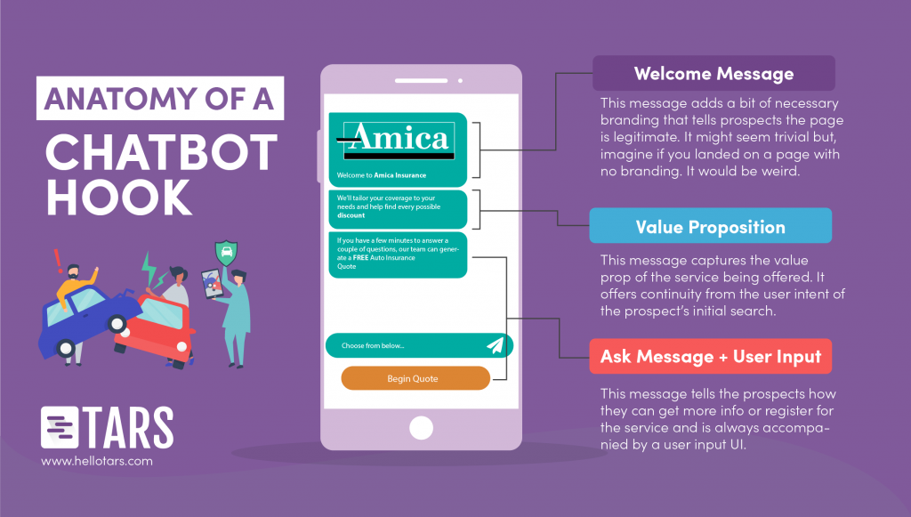
The first stage of conversational landing page creation is always phrasing a Hook. A hook is a series of three messages that establishes legitimacy, captures attention and makes a call to action.

The first message in a hook is always a welcome message with a logo. We recommend adding this element because it establishes the base level of legitimacy that your page needs to convert prospects. You might take it for granted but if you land on a page and there is no logo, it feels really weird in a bad way. Like spammy, suspicious weird to the point where you might consider dropping. This is not an outcome that any marketer wants because it is wasted money, so just add a welcome message. It doesn’t take long, and your conversion rate will thank you.
The second message in the hook is a value proposition message. Prospects have short attention spans, and in our experience, the best way to capture this attention is to convey your value proposition in a tweet-length message. A good template for this is the heading of your traditional landing page.
In this conversational landing page, I am using a sentence I found in the second fold which I really liked.
The third message (and the corresponding user input) is like the CTA on your traditional landing page. It shepherds prospects along the lead generation flow and when you are phrasing it, make it as uncontroversial as possible. By this I mean, make an ask that isn’t too personal and can be responded to without any real repercussions for the prospect. For example, in this conversational landing page I asked if prospects to Get a FREE Quote. Pressing this button doesn’t share any personal info and if prospects don’t like what they see on the other side they can close. But, once they click, they will feel more invested and might actually convert.
As an added advantage, uncontroversial asks can be responded to with a button, which is easier than tapping out a whole name or zip code.
Lead Generation Experience
Once you’ve hooked a prospect and gotten them to start the conversation, you can start capturing their lead. Doing so is unique within a lead capture context, but as a modern human being, it is not something you are unfamiliar with. Forms are impersonal and so you can get a pass by just saying First Name and then a blank field or zip code and then a blank field.
In a chat, you are bound by the rules of human etiquette. Prospects expect you to be polite, and they expect good customer service like they would if your conversational landing page were a human being. There are three simple best practices that you can implement to achieve this:
Ask full questions
This should go without saying, but don’t just say “name:” or “zipcode:” because that feels super artificial. Instead, say something like “What is your name?” or “What is your zip code?” because those phrases feel more human.
Acknowledge user input
If a prospect gives you a piece of information, don’t abruptly move on. Acknowledge the fact that you received it (even if you just say “great”) and, if required, prime them for what’s to come (something like “I need a few details to get you set up”)
Order your questions right
This comes back to the politeness factor. There are certain ways that you can order questions that feel rude, and you want to avoid them. The two most prominent are, ask for the prospect’s name first, because, in real human conversation, you always like to know who is on the other end.
And second, save contact details for the end, because one of our customers found through experimentation that prospects perceive early contact info questions as being too “sales-y.”
Design
Conversational landing pages primarily rely on text to convince users but this doesn’t mean you should neglect the visual aspects of your page. The default chat design on TARS uses generic blue and gray color palette pioneered by Messenger and iMessage and unless your insurance brand has the same brand colors as Messenger or iMessage, your page will look super generic if you don’t change it. We recommend making the bot messages your primary brand color and the user messages your secondary brand color, or if you have just one color, make both types of messages that color.
The End Result
If you follow all the steps and best practices listed above, I highly suggest that you do a quick side-by-side comparing your traditional and conversational landing pages. The difference should be apparent.

For me, the differences that usually stand out are that the conversational landing page looks much cleaner at a glance with fewer elements crowding the page and that it feels more human than the traditional landing page when you interact with it.
These might seem like cosmetic or even trivial changes, but I am sure that if you test the conversational landing page out in your marketing campaigns, you will see a dramatic 2-3x increase in your conversion rate that will make you wonder how you ever settled for anything less.

Arnav is the Director of Content Marketing at Tars. He spends most days building bots, writing about conversational design and scrolling through Giphy’s trending section looking for the gifs that go into the Tars Newsletter.

1 Comment on "[Designing Conversations] How to make a conversational landing page for an Auto Insurance Provider"